As you can tell from my February goals update post, this has been something of a fizzer.
However, I do have some older photographs that I can share on the B&W theme, so here they are:
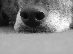
A Portrait of Benny.
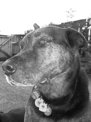
A Profile of Duke.
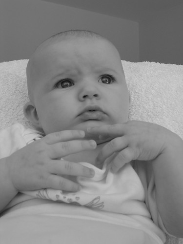
A Pensive Moment for Miss OWW.
Well that wasn't the most inspiring few photographs that I have ever taken. So I will extend this challenge through March and hopefully will come up with some better examples. And just to make it even more fun I will add another challenge: Pick-A-Colour Theme and take photographs on that theme.
Oooo, I'd better get going on this one then, since a week of the month is already gone. See you again at the end of March.

4 comments:
You already know I like Benny's nose ;-)
These are taken with the B&W mode in your camera? When I've tried this previously I've found the images looked "washed out". B&W images work better in general when they have more "punch". Even just messing with the contrast may give you a stronger image, but I cheat in Photoshop and use an action to convert mine. There are lots of opinions out there as to how it should be done to get the best results--most of them too complicated for me--but there does seem to be agreement that simply "desaturating" your colour photo does not a good B&W image make.
The sky in the Duke shot is just not there. As for your daughter, look at dark of her lashes and iris, and how this is in contrast to the whites of the eyes and the "glassey" reflections on the cornea. That's your material for B&W, rather than all that neutral and uniform skin tone. I guess I'm attempting to tactfully suggest that some color images converted to B&W work, some need to be made to work (post-processing), and others just don't work at all.
As last time I've uploaded my "contribution" to Flickr. I've tried to explain why I think these work. Only my amateur opinion.
Bruce,
All 3 photographs were taken with the B&W setting on the cameras. I have tried desaturating colour images before but it didn't work to my satisfaction.
I think Benny's nose works best because of the type and direction of the light (as well as the composition).
In my defence, the image of Duke was one of the first taken with the Canon Powershot A60 when I discovered that it had a B&W setting. :? I'll rifle through those first shots and see if any are better compositions and use of contrast.
I think that seeing how the light is falling is my problem - I don't seem to see it very well from the end-product perspective. B&W has scared me off repeatedly because of this. :cry:
Hey, no sad smilies! The B&W setting in cameras is as ineffective at producing good results as desaturating the colour image. That's no reflection on your ability—but I still maintain that some subjects lend themselves better to B&W than others. Colour can sometimes be distracting, so it's finding subjects that have something to say without the use of colour that is the challenge. I don't know if my examples "spoke" to you or not, but remember photography is personal and (when you're not making money from it) the goal is to please yourself. If you have Photoshop play around with channels (e.g. as here), which is what the action I use does. B&W is hard (especially backlit skies); I'm not allowing you to give up!
No giving up in this department. I just need to keep plugging away until the penny drops, I think.
Thanks for the link. We don't have Photoshop, but I will check out The Gimp for the channel mixer.
I agree that the key to this is subject matter that doesn't require colour to get across a sense of feeling. One of my favourite images is from the very famous Yosemite Collection - Jeffrey Pine at Sentinel Dome. I absolutely love the B&W of this image and the composition.
And after seeing a documentary, then an exhibition of Magnum photographs, I have been spoiled by the quality of images that B&W can produce (in the right hands). Eve Arnold and Elliot Erwitt are two favourites.
Looking through those sites, it does make me wonder how much has to do with composition as well as subject matter. Perhaps even more so than a colour photograph. If the composition is slightly off, can colour rescue it? But with B&W it will fall flat if the composition isn't 100% on the button ?
Just a thought...
Post a Comment